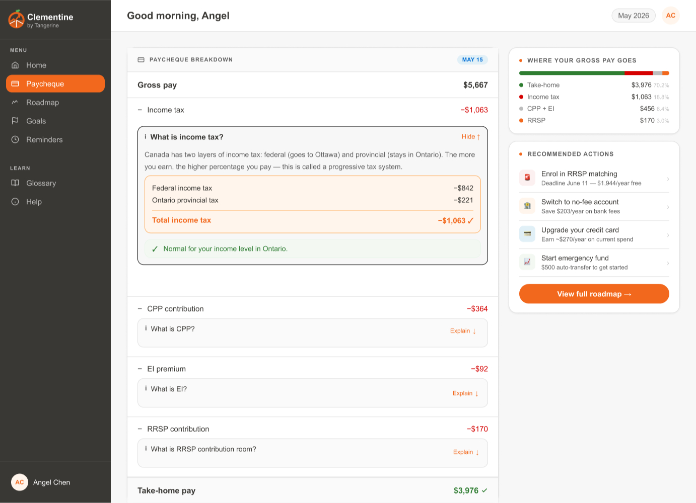
Clementine's home dashboard. Every paycheque, finally explained.
An AI finance manager that meets newcomers, new grads, and first-time mortgage holders where they are. Clementine translats Canada's confusing financial system into plain language.
Clementine's home dashboard. Every paycheque, finally explained.
When my family immigrated to Canada, I watched my mom struggle to understand a financial system that assumed she already knew the rules. Years later, as a new grad entering the workforce, I hit the same wall why was part of my paycheque just gone? What were these "mysterious" bank fees? What on earth is an RRSP?
During our hackathon brainstorm, my teammates realized they'd all asked the same questions. The financial system isn't just complex, it's quietly exclusionary to anyone who didn't grow up inside it. So we set out to build something that closes that gap.
Existing banking apps show you numbers, not meaning. For someone new to Canada or new to the workforce, that's not help, it's homework. We anchored our design around three questions real users actually ask:
Deductions like income tax, CPP, and EI appear with no explanation of what they are or why they're normal.
Bank fees feel arbitrary and hidden, with no guidance on how to avoid or reduce them.
Acronyms like RRSP, TFSA, and CPP are everywhere — and nowhere explained in plain language.
With the clock running, we moved fast but stayed disciplined — research first, design grounded in a real persona, then build.
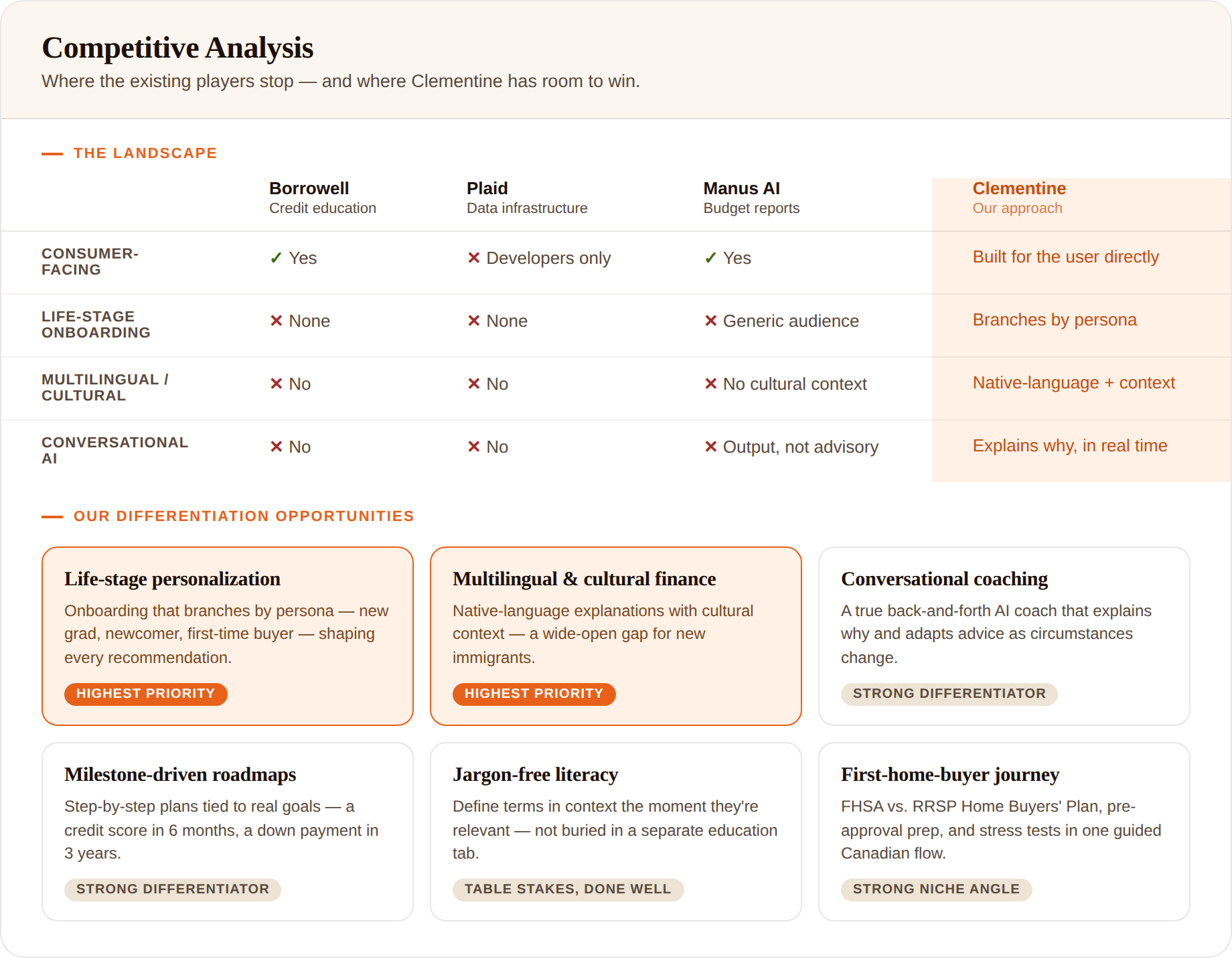
We mapped the pain points shared across our own newcomer and new-grad experiences, benchmarked existing players to find our differentiation,then plotted every idea on an impact–effort matrix and explicitly marked what not to build (view our impact-effort matrix →)
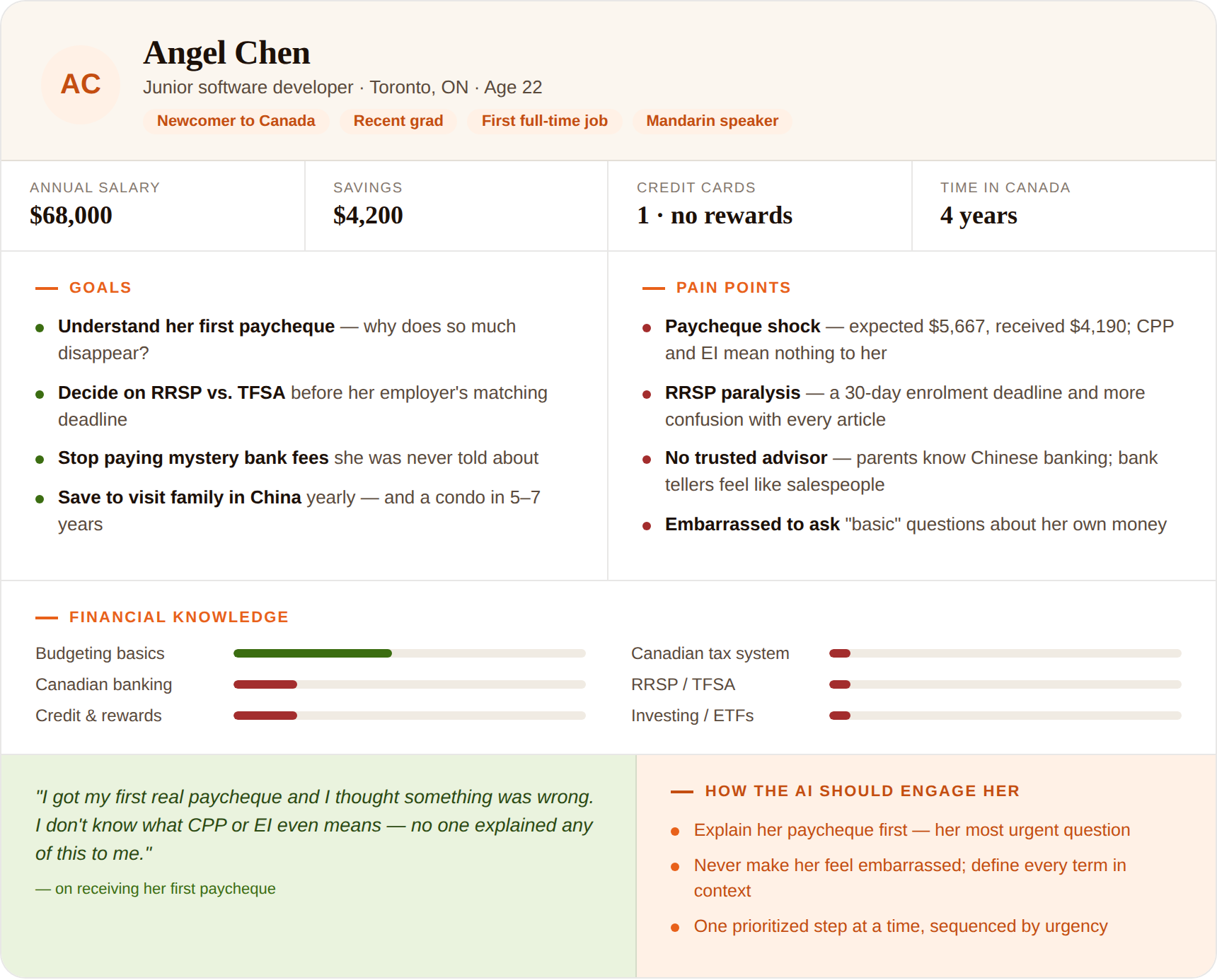
We built our design around Angel Chen, a newcomer working her first job, financial-literacy beginner, juggling RRSP decisions, bank fees, and building credit. Every screen had to work for her.
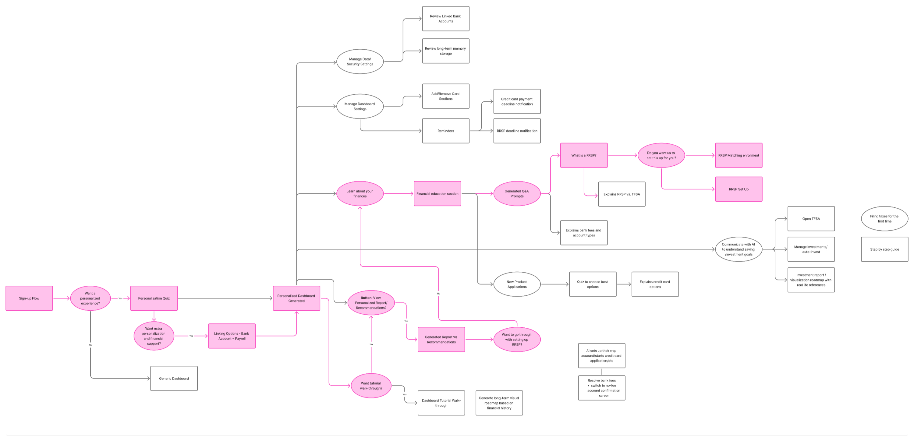
We mapped the full user flow from sign-up and personalization quiz to the generated dashboard, education prompts, and AI-guided actions. We then designed a dashboard that explains rather than just displays.
Instead of a wall of deductions, Clementine breaks down gross pay into plain-language pieces and reassures the user when something is normal for their income and province. Every line has an "explain in plain language" option.
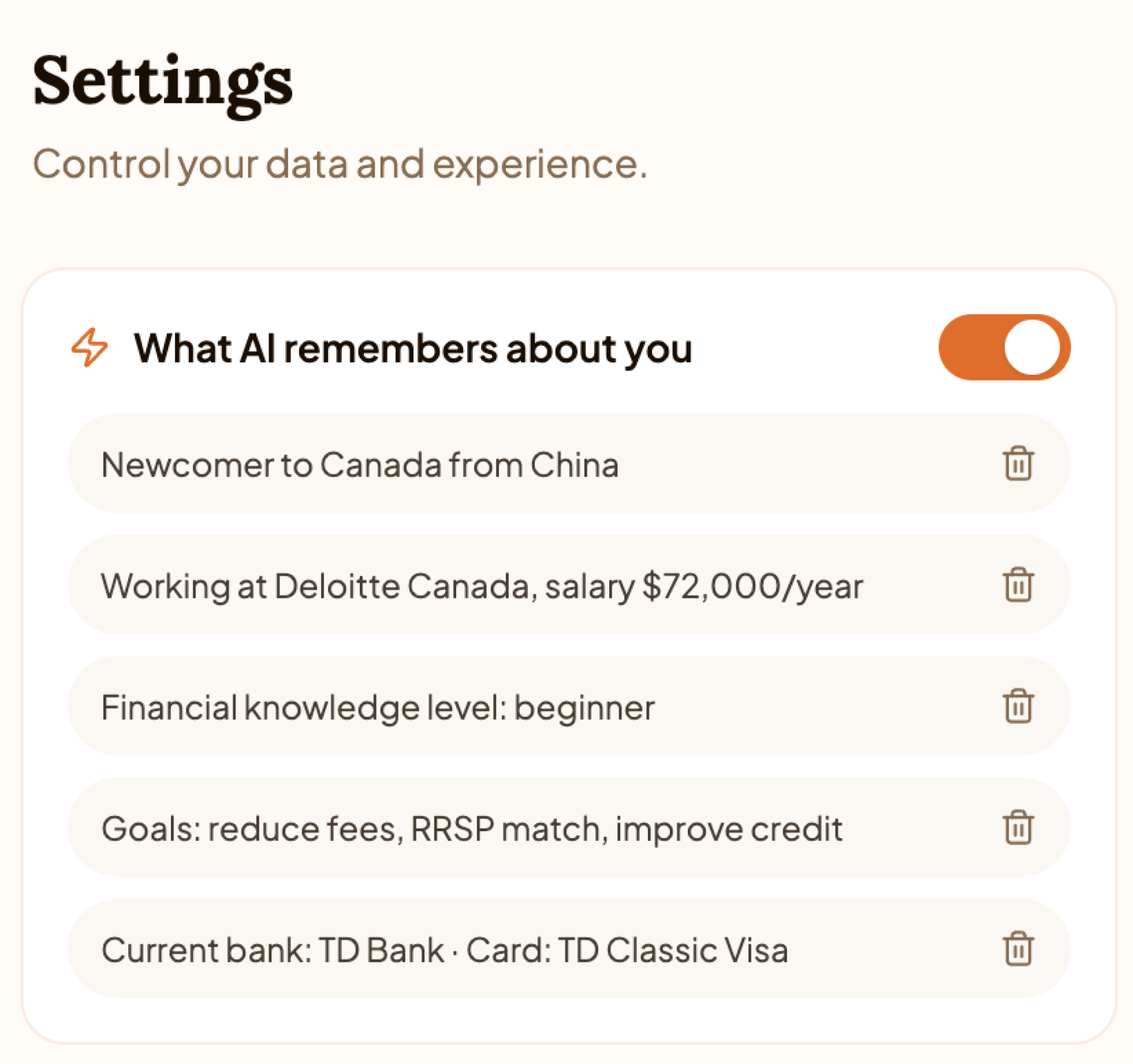
Clementine personalizes itself around what matters to each user. It remembers that Angel is a newcomer from China, new to the work force, a financial-literacy beginner with goals like reducing fees and improving credit. Users stay in control: every memory is transparent, toggleable, and deletable.
During onboarding, users set their own financial literacy level, from "just starting out" to "comfortable". Clementine adjusts how much it explains. The microcopy does quiet work here: "Be honest — there's no wrong answer." Designed for people used to feeling embarrassed by what they don't know.
Out of a room of strong teams, Clementine took 1st place at the TechTO Hackathon sponsored by Tangerine. More importantly, judges and fellow participants connected with the core idea: technology that meets people where they are.
Ten hours forced ruthless prioritization. We designed only what served Angel.
The biggest UX win wasn't visual it was the idea. Translating jargon into reassurance is what made the product feel human.
We chose to use AI where it genuinely closed a gap. Transparent, deletable memory kept the user in control. We want trust before novelty.
The natural next step is moderated testing with actual newcomers to pressure-test our assumptions about literacy levels and tone.